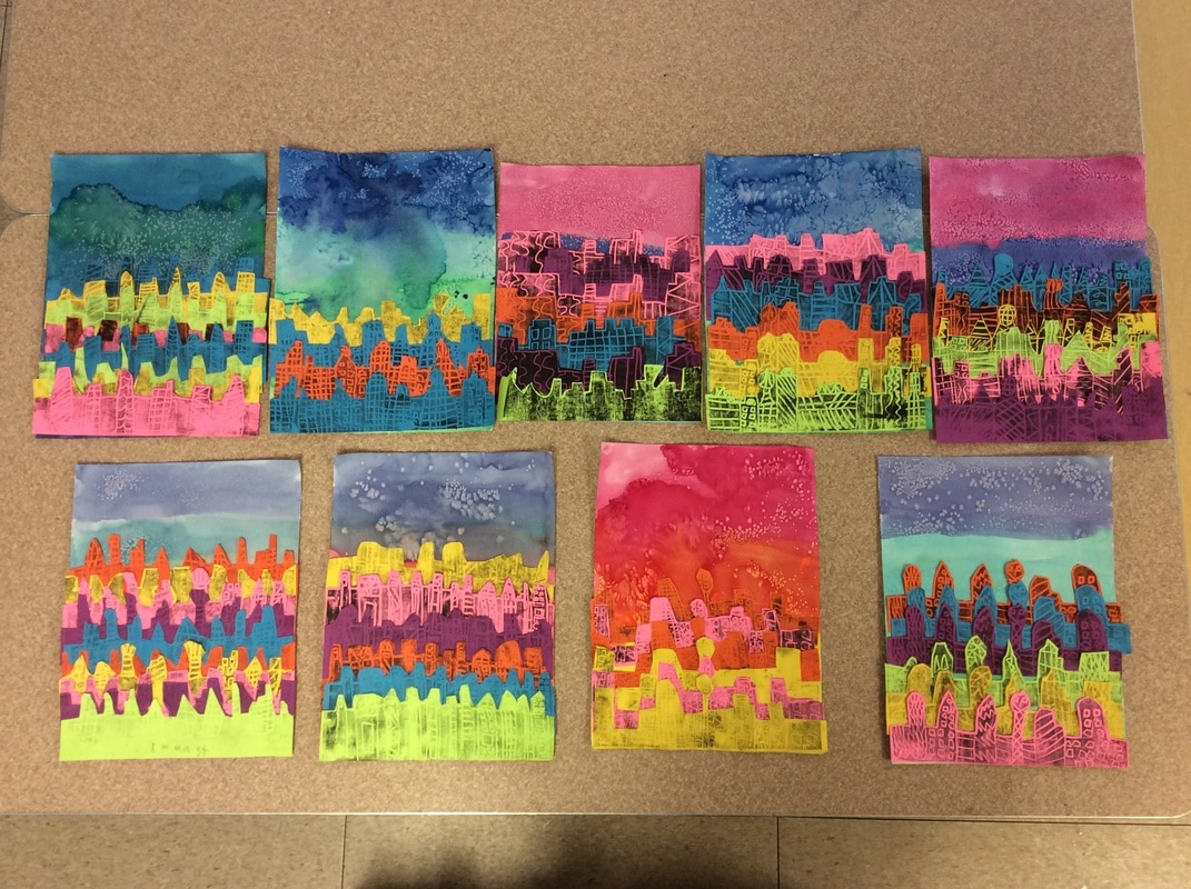
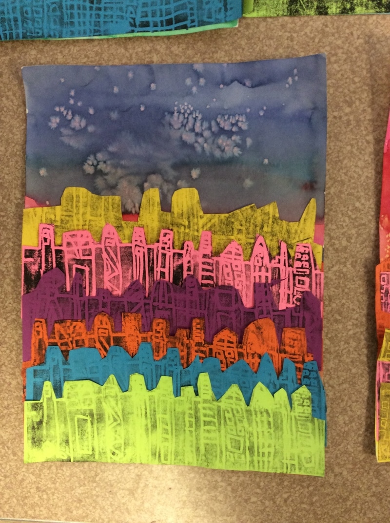
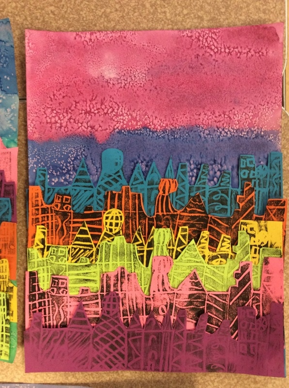
 This is 3rd grades very first printmaking project! The process for their cityscape was to crave a printing plate with the design of their city. They used patterns to create the look of multiple buildings. Students then used the plate and ink to pull 6 prints. Once the prints were dry students cut them out and overlapped them to create the illusion of a city off in the distance, or the element of space. They also painted their skies with watercolor in an analogous color scheme. They did a fantastic job with a very challenging project!
0 Comments
Thanks to our amazing PTA here at Robinson Elementary we were able to get some new storage here in the art room. One of my main goals for creating a more organized space was to make it easier for students to find what they need and be more independent. Artists need to be able to decide which material will be best for each work of art they create. Just because an artist loves to paint does not always mean that every design will work best in paint. Students have the opportunity to practice in their sketchbooks in order to determine what will work best for them. 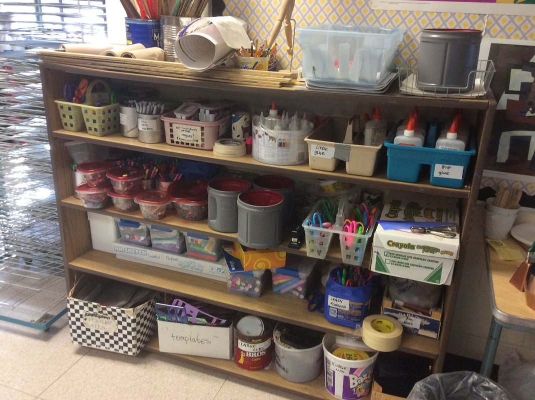 BEFORE When I first arrived at Robinson last year I was happy to see the variety of materials available to our students. At the same time I was overwhelmed by the "variety" of containers they were being stored in. I knew that if I was being visually overstimulated and unable to find what I was looking for, it would take students twice as long! It was also a challenge to fit everything onto our shelves with so many different shaped containers. That is when I came up with the idea of color-coding materials by table. Each table has access to the same materials, they are organized in the same order for each table separated by color. Students have done any amazing job keeping them organized and has sped up their clean-up process! Less time cleaning means more time art-making! 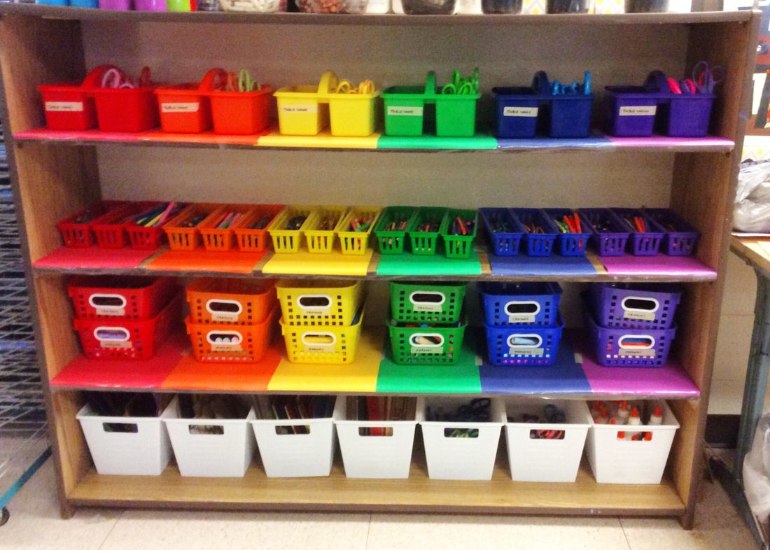 AFTER What do you think? I am loving the way it looks and the students do too!
The craziest part is that it is all the same materials, nothing was moved or thrown out. It is amazing what new containers can do for a space! THANK YOU TO OUR WONDERFUL PTA FOR SUPPORTING OUR ARTISTS! 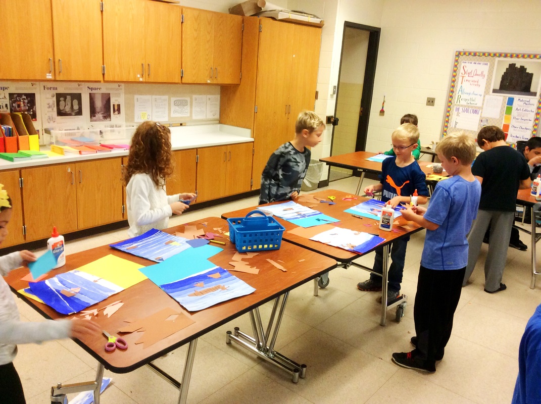 This is one of my favorite projects to do with 3rd grade and these artists did awesome! These turned out so beautiful and it was a perfect way to say goodbye to that summer warmth. I love seeing how different they all are! Our first learning target with this project was to use white to mix multiple tints of blue. Our second learning target was to use proportion to show depth and space within our Seascape. On our first day students worked in teams to mix multiple tints to create a beautiful value scale. When students returned they used their painted values to create their collages. Below are some featured artworks! Featured Artists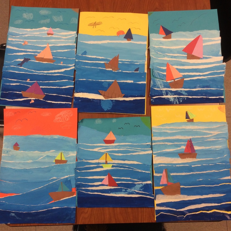 Mulvahill Top: Ashley, John, Delaney Bottom: Lydia, Ethan, Haylie 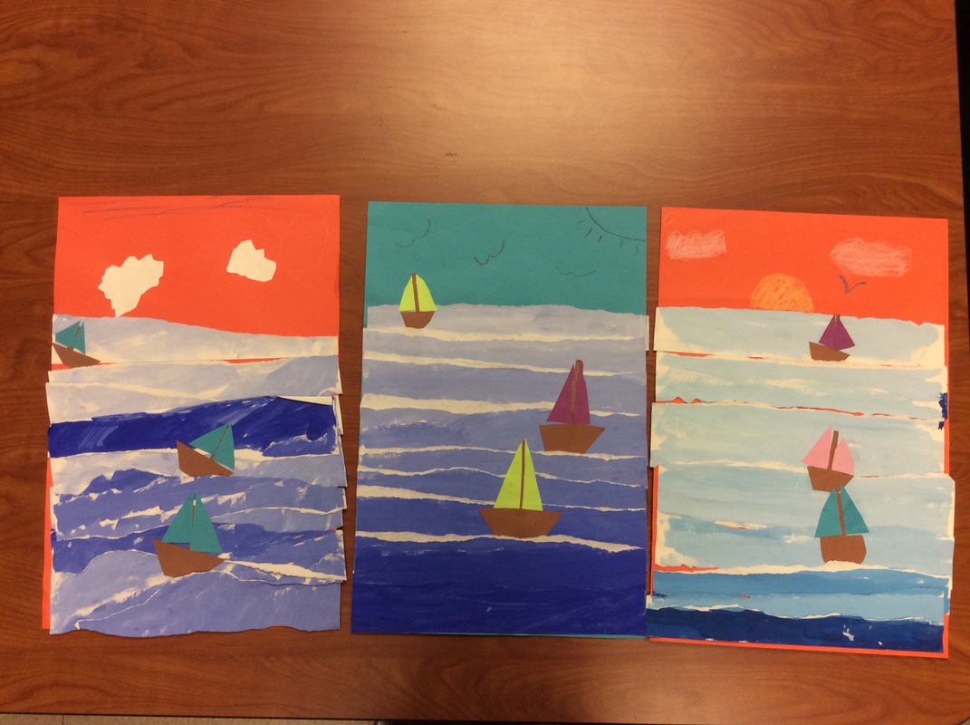 Sexton Gauge, Alysen, Savi 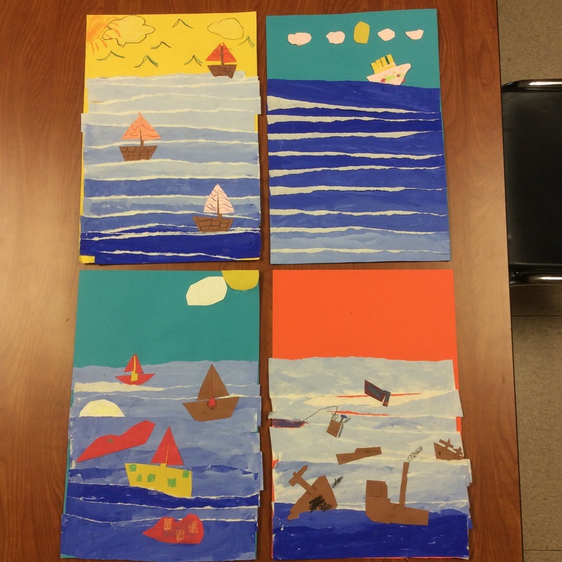 Tooker
Top: Destiny, Darby Bottom: Andrew, Cole 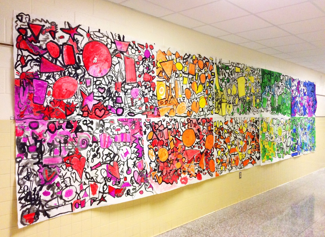 I love to start every year with a large collaboration project. This gives students the opportunity to jump into the art action painting on our very first day together! It also gives them the chance to be a part of something bigger than they could accomplish on their own. Our art room is not only a single class but a community filled with artists that come to this place to explore and create. I want each student to feel as though they are a part of this community and our collaboration displays offer that in a fun and exciting way. 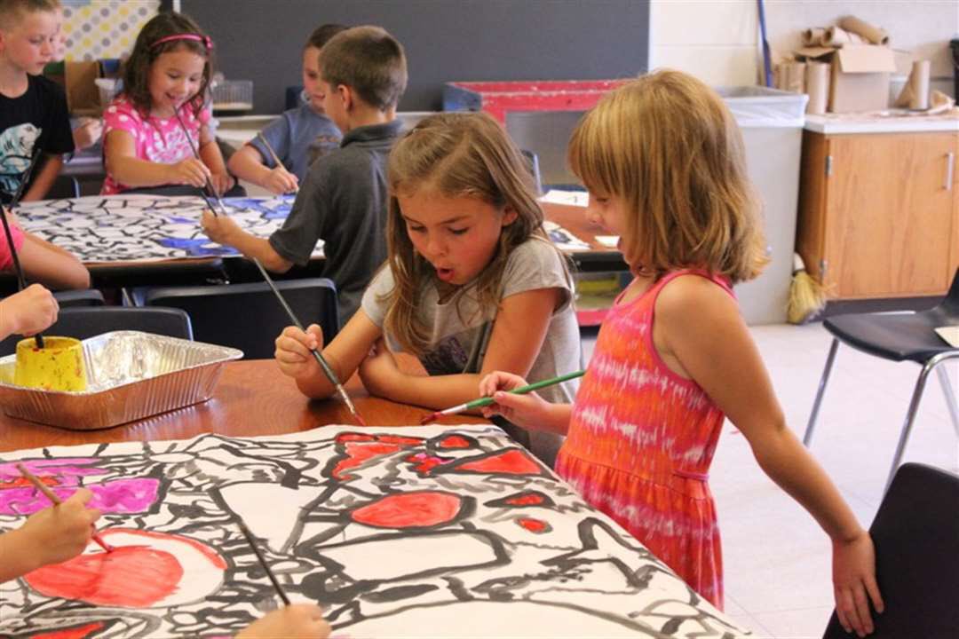 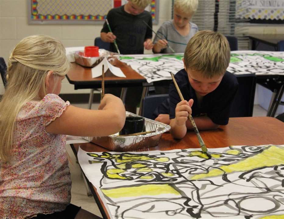 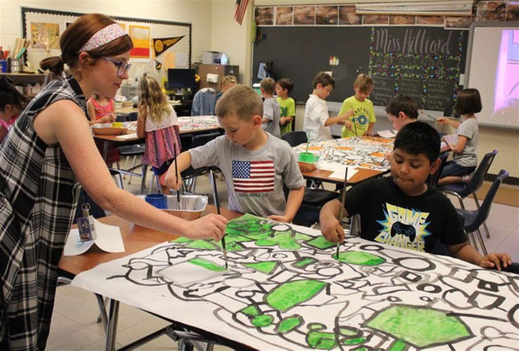 This was created by 2nd, 3rd, and 4th grade! Each class did a different step in the process and once it was completed we hung them all together to create a gorgeous non-objective rainbow outside our creative space!
I am so proud of all the work the students did starting the year off right! |
Miss HilliardHello there! I teach K-4 art at Peach Plains and Robinson Elementary Schools in Grand Haven, MI. Archives
December 2016
CategorY
All
|
 RSS Feed
